possession flow

Building on the drive summary plot design introduced a few weeks ago and inspired by last week’s look into historic handmade possession diagrams, this week I’m pulling a few elements together into an overall game possession and drive summary visualization:

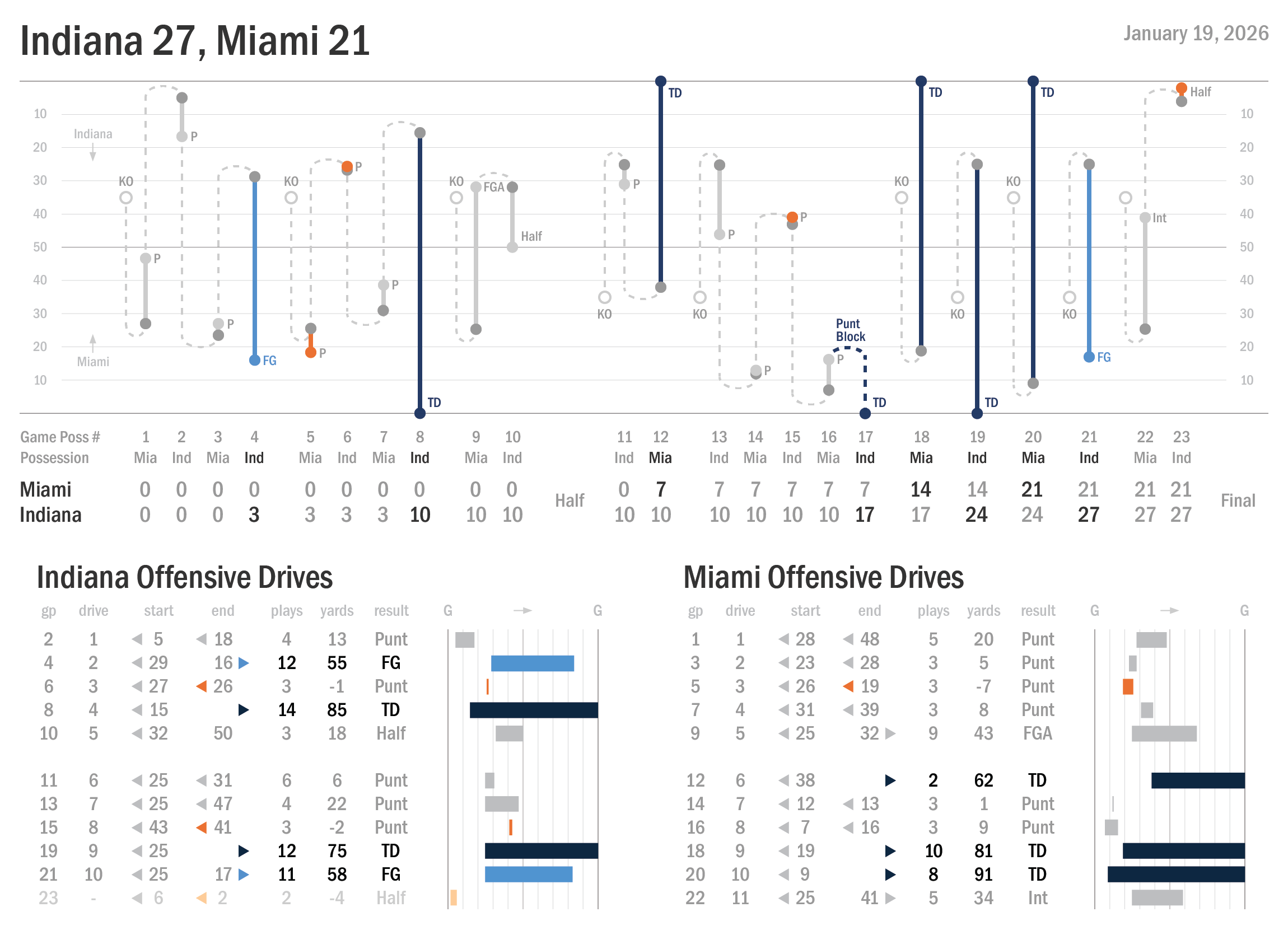
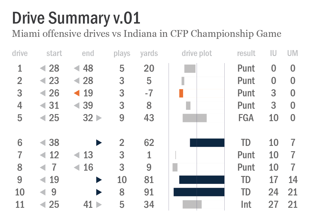
Data visualization of the CFP National Championship game played on January 19, 2026 and won by Indiana over Miami by a final score of 27-21. The visualization elements include a primary chart of the flow of alternating possessions, highlighting scores by each team and key possession change events. Illustrated tables at the bottom of the chart provide more specific information about Indiana and Miami’s respective offensive drive results.

The main idea is to provide all of the basic possession data that I collect from each FBS game and package it into an attractive and replicable chart template that can serve as a quick game summary reference tool that also invites a deeper dive into the details. I would like to think the visualization is working effectively without requiring a companion “how to read and interpret this chart” legend, but perhaps that’s a bit optimistic. Here’s a rundown of what’s here (and what isn’t here) along with some of the design choices I made along the way.

  • The main graphic element under the header is a chart that illustrates the possession flow of the game. Every possession (as I define them) is included, an alternating sequence that starts with the opening kickoff of each half. I tilted the field 90 degrees from how charts like these are often displayed so that the game sequence proceeds from left to right, with alternating possession of the ball moving up and down along the way.

  • Possessions are primarily encoded with solid lines that connect dots to denote starting and ending field position on offensive drives. Touchdowns and successful field goal possessions are highlighted and color-coded, as are offensive drives that lose yardage. The colors in the possession flow chart match those in the drive summary charts below it.

  • Possession exchanges are encoded with dotted lines that represent the “hidden yardage" advantages and disadvantages realized with each special teams or turnover event in the game, and I “looped” the dotted lines to connect one possession to the next for readability. Note that I made the choice not to bother with the specifics of those special events. Whether a kickoff was fielded and returned to the 25-yard line or whether it was kicked through the end zone and resulted in a touchback is irrelevant to me — only the resulting field position is represented in the chart. This is apparent in the punt block touchdown event as well; the bold dotted line doesn’t indicate precisely where the ball was blocked behind the line of scrimmage, recovered, or run in, only that this important non-offensive score event happened.

  • I resisted crowding the graphic with too much text notation, but there’s a risk that the abbreviations (“P” for punts, “KO” for kickoffs, etc) are indecipherable or unfamiliar. And I’m still thinking about whether some other drive-ending events (turnovers, failed field goals) should receive more visual attention than, say, punts.

  • I played with several alternatives for indicating the direction of play for each team, and I’m not certain if I’ve successfully made this easy to understand and follow. I also recognize that we don’t witness game play in the same way when we watch the game, so this might aggravate the potential for confusion. Teams flip the direction of play at quarter breaks on the field, but here in the chart they move in the same direction throughout the game. It might take a minute to get your bearings if you’re encountering this format for the first time.

  • The drive summaries are largely unchanged from the original iteration of these, but I did rearrange some of the elements. Each team’s drive plot progresses from left to right here, which I think makes it easier to compare how the offenses (and the opposing defenses) played over the course of their opportunities. Again, though, there is the a chance that this design choice is disorienting.

  • Finally, note that Indiana’s last offensive drive (two plays, minus-4 yards on kneel-downs to end the game) is faded out and unnumbered. This is intended to represent that it was a “garbage” possession (again, as I define it). Including the end of game sequence and the punt block touchdown, Indiana had more total game possessions than Miami (12 to 11). But Indiana only had 10 non-garbage drives, one fewer than the Hurricanes.

I think I like all of these choices so far, and I think the design elements (colors, lines, marks, font weights, etc) are working well to facilitate comprehension. What do you think? Hit me up with a comment here or on social media. My next step is to build on this template and experiment with new ways to visualize the efficiency data metrics I draw from the core possession data set.

nash marks

There’s no time like the present to obsess over old school, hand-illustrated possession charts.

Image from “The Rose Bowl: A Complete Action and Pictorial Story of Rose Bowl Football” book by Maxwell Stiles, a chart detailing possession sequences, annotations of key plays and players, and a summary table of game statistics for California’s 1938 Rose Bowl victory over Alabama.

I have flipped through this 80-year-old book once before, but I was thrilled to rediscover it again last week. Maxwell Stiles’ “The Rose Bowl: A Complete Action and Pictorial Story of Rose Bowl Football” documents every Rose Bowl game played from 1902 to 1945, with delightful prose woven together with accounts from sportswriters that covered the matchups. For a flavor of the writing, here’s a description of a muffed punt in the 1925 game:

Solomon […] gets a pound of butter all over his hands. He slaps at the ball, grabs at the ball, falls onto the ball. Each time, like a squealing greased pig, the oval eludes his grasp.

Among the book’s many treasures are illustrated possession and statistics charts, like the one above, that accompany each game summary. The charts are attributed to the book’s editor, Ward B. Nash, and I love everything about them.

Let’s start with the fact that they are literally handmade. The gridlines that frame the progression of plays and possessions and the table rows and columns are crafted with straight and measured lines, but everything else is handwritten. Nash has fine penmanship and near-linear text alignment, but it doesn’t appear that he used a ruler to illustrate anything — he just carefully drew and spaced out lines, symbols, and text for maximum data density and legibility within the template. We can trace our finger along as the game progresses, noting slight variations in how each data point is encoded, drive by drive and event by event.

Yes, the density of data squeezes some of those annotations into tight spots. It’s relatively easy to spot Vic Bottari’s touchdown that gave Cal a 7-0 lead in the 2nd quarter. But it’s a bit more difficult to read all of the text notes on the drive that led up to that touchdown. First downs are clearly identified throughout the game, but it’s hard to decipher the full sequence of plays — was that Hughes punt on 2nd or 3rd down? College football game play has changed dramatically over eras, of course, and part of the joy in poring over an old game account in this format is discovering some of those exotic nuances with a careful scrutiny of the chart details. Cal forced a fumble near its own goal line in the 4th quarter… and then immediately punted. Analytics!

I’m also thinking about the choices Nash made on what data to include and what to omit. Since he illustrated each of these for a book that covers 43 years of games, he needed a design template that allowed him to feature (mostly) the same set of data elements in each, even as the sport evolved over that span. There were no forward passes in the first Rose Bowl game, a 49-0 victory by Michigan over Stanford on January 1, 1902 — forward passes wouldn’t officially become legal plays in college football until 1906. (The field was also 110 yards in length in the first Rose Bowl; the 100-yard standard was adopted in 1912). In the 1945 game that concludes the book, Alabama and USC combined to complete only 6 out of 22 pass attempts, but those infrequent plays were nevertheless impactful and they pop in Nash’s chart design.

Ward Nash wasn’t the first to develop this style of game possession illustrations, though his 1961 obituary credits him with devising (unspecified) “statistical methods used in collegiate and professional football”. In a brief quest this week to find documentation of the origins of these charts, several kind folks in my social media network shared examples dating back to 1892, a selection of which are provided below.

“World’s Football Chart showing exact position and time of every movement” — time of day (not time of possession), that is; Princeton 6, Yale 0 (1893) via @QuirkyResearch

This chart includes details not just of kicks, runs, and passes, but also instances of when the “ball rolled”, indicates the shift in direction of play for each team by quarter, and deviates from a top-to-bottom line progression when necessary to fit possession sequences in boxes for each quarter; Nebraska 14, Notre Dame 6 (1922) via @HuskerMax

“Showing How the Tide of Battle Ebbed and Flowed” with abstract (?) geometric lines detailing possessions; Stanford 10, California 10 (1892) via @QuirkyResearch

Game illustration detailing only a few basic elements — possession, kicks, rushes, fumbles, and penalties; Minnesota 8, Nebraska 5 (1907) via @HuskerMax

Published in “Graphic Methods for Presenting Facts” by Willard C. Brinton in 1919, a game possession chart details the second half of the Harvard-Yale football game played in 1912.

I’m struck by the design and style variations in each of the examples. It was common for newspapers across the country to publish charts like these throughout the first half of the 20th century, but there apparently wasn’t a rigid style guide adopted by everyone. Even when charts included the same featured statistical elements, they used different methods to encode the information. Kickoffs are squiggly lines. Or dashed lines. Or arched lines. Or hatched lines.

Template with examples of how to chart a football game; “The Official’s Football Chart and Score Book” (1931), via @FootballArcheology

Willard C. Brinton’s “Graphic Presentation” (1939) includes a possession chart (Harvard 13, Yale 6) attributed to Victor O. Jones, Sports Editor of the Boston Globe, along with this note:

After the game, spectators often would like to have a picture of the various plays before them so that any confusion as to what actually did occur may be seen at a glance. The work sheets from which the chart was made were of heavy cardboard and easy to handle at the game. It may be possible that standards for this type of chart will evolve in the future.

Today, we have sophisticated digital tools and a wealth of game data at our disposal with which to craft a limitless array of college football charts and graphics. I love a well-designed Illustrator graphic as much as anyone, but part of me is a little bit sad that charting game data by hand like this fell out of favor more than half a century ago. Had the format remained popularized into the 1980s, maybe I’d have a shoebox full of heavy cardboard possession charts dating back to the first games I watched and attended as a kid. I’m grateful to have stumbled (again) across the work of Ward Nash and other mostly anonymous newsroom illustrators that built a visual language around the early game and its statistics. I hope to continue to develop and refine my data visualization work, by hand or otherwise, with the same inspired clarity and purpose.

drive plotting

I’ve been working on better ways to visualize college football game data for as long as I’ve been collecting it. This is the start of what I hope/expect will be a series of whiteboard posts about the development and refinement of new game and possession data visualization standards.


Chart titled “Drive Summary v.01”, an illustrated data table representing Miami’s 11 offensive drives against Indiana in the CFP Championship on January 19, 2026. Each row includes the drive number, starting and ending field position, plays, yards, drive result, and the game score at the conclusion of the drive, plus a graphic representation of the "drive plot".


First, a hat tip to my friend Chris Gallo’s great work over the last few years on new and unique ways to represent drives and possessions here, here, and here. I was also inspired this week by Neil Paine’s drive summary of New England’s offensive possessions in their Super Bowl loss to the Seahawks. I highly recommend subscribing to each of their substack newsletters.

In the Drive Summary v.01 chart above, I’m providing all of the information I collect for every offensive drive in every FBS game. Everything on my site — FEI ratings, strength of schedule and strength of record ratings, points per drive, etc — originates from this basic data set. Where did the possession start and end, how many plays were run, how did it end, and what was the score. That’s it. Rinse and repeat for hundreds of thousands of possessions since 2007.

Data tables are great tools for data analysis, but they’re pretty dry reading. How can I structure a more visually appealing version that invites at-a-glance insight into the the flow of the game? That’s what I’m attempting with this graphic. There are a couple of visual vocabulary elements here in particular that I think are relatively intuitive for casual football fans to easily interpret and understand, and I’m curious if they’re really working the way I think they should.

Where Miami started each of its offensive drives is listed in a column under the ‘start’ header — it’s own 28-yard line, own 23-yard line, own 26-yard line, etc. Just the yard line number itself is provided, accompanied by a small triangle symbol pointing to the left. That little triangle is my solution to avoid using “own” or “opp” (opponent) syntax with every entry, which I think would unnecessarily clutter things. The ‘end’ column uses the same triangle symbol flipped to point to the right for drives that ended in opponent territory.

I also included a ‘drive plot’ with a set of bars that represent the starting and ending field position for each drive. I’ve tried a few variations on this that include more gridlines and annotations, but I think that simplicity here might be best. I also chose to color code touchdowns distinctly (dark blue bars) as well as drives that lost yardage (orange bars). And to reinforce and highlight these drives from the others, I color matched the little triangles in the ‘start’ and ‘end’ columns.

My next step is to work on pairing this with opponent drive data from the same game. I’m genuinely open to questions and suggestions! Is the visual vocabulary clear and easily understood? If not, what might you change or recommend? What other data do you want to see as this develops? Leave a comment or hit me up in another way. We’re just getting started.

connecting dots

Possessions per game have steadily declined since 2015, points per game reached a 15-year low in 2025, plays per game have held steady over the last three seasons, points per possession appear to be leveling off, and plays per possession jumped to a 19-year high...


Chart series titled "FBS vs FBS Trends, 2007 to 2025" with line charts illustrating trends in Possessions Per Game, Points Per Game, Points Per Possession, Plays Per Game, and Plays Per Possession


One benefit of maintaining a large data set comprised of the same parameters over a period of time is the opportunity to take a step back and make note of trends. I examined the distribution of game possessions over time in a previous post, but the simple line chart above illustrating average (mean) possessions per game by season highlights an even more striking trendline. Since 2015, possessions per game have been declining at a nearly linear rate each year.

What do we make of this trend? The most frequent reaction I receive when I share this data on social media revolves around clock rule changes that appear (to some) to have taken football away and replaced it with more commercial breaks. I’m not particularly interested in exploring broadcast data myself, though I appreciate that others do. I know that clock rule changes (in 2008 and 2023, specifically) have had an impact on possession counts, but I’m struck by the near-linear decline over the last decade which indicates some additional factors are involved. There isn’t one thing that we can isolate as the reason for a steady decline in FBS possessions per game, it has to be a number of things in combination.

No-huddle, up-tempo offenses were very much in vogue in the mid-2010s, but have fallen out of favor since peaking in 2014-15 or so. Coach-to-player (C2P) helmet communications were introduced in 2024, and a new common cadence of offense pre-snap operational pace may be a by-product. Analytic tools have led coaches to adopt more aggressive decisions in 4th down situations. And as recently explored by my friend Parker Fleming, offenses and defenses are cyclically adjusting and adopting new strategies on how best to attack and defend to tilt game states in their favor. Trading explosive plays for methodical drives inevitably leads to changes (intentionally or otherwise) in the length and number of game possessions.

I like that this chart series positions the smooth possessions per game trendline in comparison to other less linear trends. Fewer possessions per game doesn’t exactly mean less football, it means different football. Scoring rates changing over time means something is probably happening with offenses and with defenses. College football is a complex game and it keeps changing in large and small ways. I’ve made versions of these charts before, but I don’t know that I ever would have accurately predicted where the trendlines would go next.

possession bubbles

Let’s talk about visualizing game possessions in college football. Clock rule changes in combination with pace of play trends and improved offensive efficiencies have impacted the distribution and median number of possessions per game over the last 19 seasons.

Chart titled "Possessions Per Game Season Distributions", a bubble chart representing games played between FBS opponents plotted by the number of total game possessions. Columns of bubbles are organized by season, 2007 to 2025. Labels for the median number of possessions per game by season are included, which along with the distributions themselves, drift down from a median of 27 game possessions (in the 2007 and 2012-2015 seasons) to a median of 24 game possessions (in the 2023-2025 seasons).

This chart is the result of a number of iterations and attempts to both visualize a trend and illustrate the totality of a large data set. I’m not sure if I’m satisfied with all of the choices that were made and it’s possible I’ll go back and refine it further. Charts are never done!

Let’s start with the data itself. There have been 14,130 games played between FBS opponents since 2007, and all of them are represented somewhere in the chart. That tiny bubble in the lower right-hand corner? That’s the Army vs Temple game in 2025 that had only 12 total game possessions (6 for each team!), fewer than any of the other 14,129 games played in the span. The tiny bubble separating itself from the rest at the top of the ‘15’ column? That’s the Arkansas State vs UL Monroe game in 2015 which featured 46 total game possessions (23 for each team!), more than in any other game since 2007.

Most games are represented as part of a larger bubble, grouped with all other games in the given season that had the same number of possessions. That big bubble in the 2025 column with the number ‘24’ over it represents the 106 games this past season that each had 24 total game possessions. The area of that bubble — which also happens to be the largest bubble in the chart — is 106 times larger than the area of the Army-Temple bubble in the same column.

I made a lot of chart drafts before settling on one:

An assortment of chart drafts of various types (bubble charts, line charts, histograms) visualizing game possessions.

The chart type I settled on helps identify outliers (if you squint) that might spark curiosity, and it also provides an overview of game possession distributions for each season, even though the details of those distributions aren’t explicit. (Are they normal bell curve distributions? Maybe?) I also didn’t bother to include a legend to translate the relationship between bubble size and game counts, because the primary purpose of the chart is to illustrate the year over year trend.

I played with a few different ways to highlight that trend, but I struggled a bit with making sure it was obvious enough. I decided to make the median number of game possessions per season — sometimes, but not always the largest bubble in each column — the featured data point. And instead of highlighting featured bubbles with a different color or shade, I dropped the data point label itself on those bubbles. I like that choice. I think.

hoosiers

Fifteen wins over FBS teams. Eight wins over FEI top-30 teams. Four wins over FEI top-5 teams. No losses. No matter how you slice the data, the 2025 Indiana Hoosiers are the most accomplished national champion to date.

Chart titled "Best and Most Accomplished National Champions", a triptych of scatterplots illustrating the relationship between "best" (FEI) ratings and three versions of "most accomplished" (FEI-based strength of record) ratings for all teams since 2007. National champions for each season are highlighted. The 2025 national champion Indiana Hoosiers are separated from the pack in all three scatterplots.

There’s a lot of data visualized here, so let’s break down what is going on in these charts.

As described in the chart sub-header, final ratings for all teams since 2007 are represented with a gray dot in each scatterplot. The x-axis is each team’s FEI rating (see final 2025 ratings here, along with links to final FEI ratings for previous seasons). The first column of data that is represented in these charts is the FEI column. Note that the x-axis FEI data is common for each of the three charts in the graphic; if these charts were interactive instead of static — that is, if this was a single plot that you could cycle through three versions of — the dots would only slide up and down, not left or right.

The y-axis data, however, is different in each of the three scatterplots. The data is drawn from the same FEI ratings pages, but it comes from the “strength of record” columns (EWD, GWD, AWD data), three different ways to rate teams based only on win/loss outcome against the strength of opponents faced.

I decided to include a small visualization of what the entire scatterplot looks like in the corner of each chart, with an area of detail highlighted and blown up. The shape of each scatterplot might be interesting in and of itself, but this visualization isn’t featuring that relationship. Instead, it’s using it as the backdrop to feature comparisons of specific teams, national champions.

I didn’t want to clutter the chart with too much annotation, but I know this chart makes some assumptions that might not be particularly inclusive. It labels national champions only by year (more specifically, only with a two-digit code representing the year; 25 = 2025, 07 = 2007, etc), useful shorthand for people that follow college football closely, perhaps, but it’s definitely limiting. An Alabama fan might be able to quickly pick out recent championship seasons for the Crimson Tide, but I have to think for a second about which championships were won by Alabama or by Clemson in the 2015 to 2018 stretch. 2025 national champion Indiana is right there at the top of each chart, but it doesn’t say “Indiana” and you have to decode what the highlighted data and labels are intended to represent.

One insight that the charts are intended to illustrate is that there are several (many, of course) ways to answer the question of which team is “best” or “most accomplished”. And perhaps that will prompt some exploration of the underlying data.

whiteboarding

Welcome to the bcftoys whiteboard, something new here at the site. Aside from social media interactions, I haven’t otherwise had a feedback loop for folks that want to engage with FEI ratings, data visualizations, and more stuff that I produce. The whiteboard isn’t a fully developed idea yet, but perhaps it might be a place where a college football data community can form.

I won’t promise a specific posting frequency from the jump, nor can I predict how this space might evolve, but I think it will initially include stuff like this:

  • A place to post my data visualizations, hopefully peppered with some additional notes and context for folks that want to dig deeper on the data and design choices that were made.

  • A place to kick around ideas of data projects to tackle, questions that might be able to asked and answered in new and different ways, chart drafts to work through, and college football data minutiae to inspect and pick at.

  • Possible musings/rants/takes? I’ll resist spending too much energy or time on the college football discourse du jour, but I know I sometimes want to flesh out, organize, refine, or even debate my perspective on data-relevant stuff.

If you want or need to know something more about the data on this site, let me know! If you can’t figure out what a chart is trying to communicate because it’s too wonky or unclear, speak up! If we find ourselves here one day in a comment section echo chamber of a whiteboard post complaining about how there should be smarter data-driven decision making among the power players of our favorite sport, okay, let’s hash that out together.

Drop a comment here or on any other post, reach out via email at bcfremeau@gmail.com, and/or ping me on Bluesky or X/Twitter, I’d love to hear from you.