
possession bubbles
Let’s talk about visualizing game possessions in college football. Clock rule changes in combination with pace of play trends and improved offensive efficiencies have impacted the distribution and median number of possessions per game over the last 19 seasons.
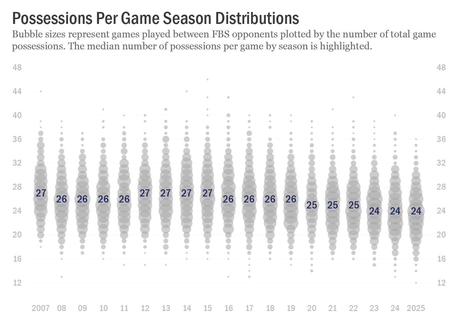
Chart titled "Possessions Per Game Season Distributions", a bubble chart representing games played between FBS opponents plotted by the number of total game possessions. Columns of bubbles are organized by season, 2007 to 2025. Labels for the median number of possessions per game by season are included, which along with the distributions themselves, drift down from a median of 27 game possessions (in the 2007 and 2012-2015 seasons) to a median of 24 game possessions (in the 2023-2025 seasons).
This chart is the result of a number of iterations and attempts to both visualize a trend and illustrate the totality of a large data set. I’m not sure if I’m satisfied with all of the choices that were made and it’s possible I’ll go back and refine it further. Charts are never done!
Let’s start with the data itself. There have been 14,130 games played between FBS opponents since 2007, and all of them are represented somewhere in the chart. That tiny bubble in the lower right-hand corner? That’s the Army vs Temple game in 2025 that had only 12 total game possessions (6 for each team!), fewer than any of the other 14,129 games played in the span. The tiny bubble separating itself from the rest at the top of the ‘15’ column? That’s the Arkansas State vs UL Monroe game in 2015 which featured 46 total game possessions (23 for each team!), more than in any other game since 2007.
Most games are represented as part of a larger bubble, grouped with all other games in the given season that had the same number of possessions. That big bubble in the 2025 column with the number ‘24’ over it represents the 106 games this past season that each had 24 total game possessions. The area of that bubble — which also happens to be the largest bubble in the chart — is 106 times larger than the area of the Army-Temple bubble in the same column.
I made a lot of chart drafts before settling on one:
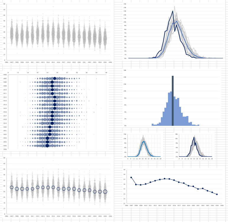
An assortment of chart drafts of various types (bubble charts, line charts, histograms) visualizing game possessions.