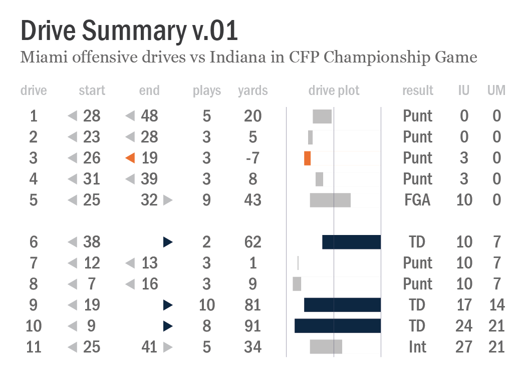
nash marks
There’s no time like the present to obsess over old school, hand-illustrated possession charts.
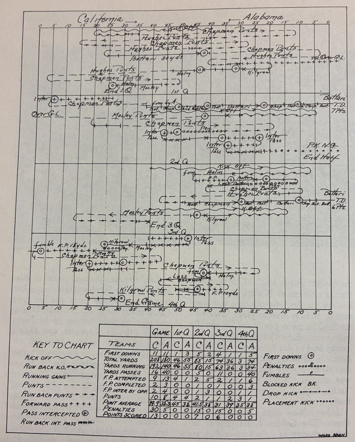
Image from “The Rose Bowl: A Complete Action and Pictorial Story of Rose Bowl Football” book by Maxwell Stiles, a chart detailing possession sequences, annotations of key plays and players, and a summary table of game statistics for California’s 1938 Rose Bowl victory over Alabama.
I have flipped through this 80-year-old book once before, but I was thrilled to rediscover it again last week. Maxwell Stiles’ “The Rose Bowl: A Complete Action and Pictorial Story of Rose Bowl Football” documents every Rose Bowl game played from 1902 to 1945, with delightful prose woven together with accounts from sportswriters that covered the matchups. For a flavor of the writing, here’s a description of a muffed punt in the 1925 game:
Solomon […] gets a pound of butter all over his hands. He slaps at the ball, grabs at the ball, falls onto the ball. Each time, like a squealing greased pig, the oval eludes his grasp.
Among the book’s many treasures are illustrated possession and statistics charts, like the one above, that accompany each game summary. The charts are attributed to the book’s editor, Ward B. Nash, and I love everything about them.
Let’s start with the fact that they are literally handmade. The gridlines that frame the progression of plays and possessions and the table rows and columns are crafted with straight and measured lines, but everything else is handwritten. Nash has fine penmanship and near-linear text alignment, but it doesn’t appear that he used a ruler to illustrate anything — he just carefully drew and spaced out lines, symbols, and text for maximum data density and legibility within the template. We can trace our finger along as the game progresses, noting slight variations in how each data point is encoded, drive by drive and event by event.
Yes, the density of data squeezes some of those annotations into tight spots. It’s relatively easy to spot Vic Bottari’s touchdown that gave Cal a 7-0 lead in the 2nd quarter. But it’s a bit more difficult to read all of the text notes on the drive that led up to that touchdown. First downs are clearly identified throughout the game, but it’s hard to decipher the full sequence of plays — was that Hughes punt on 2nd or 3rd down? College football game play has changed dramatically over eras, of course, and part of the joy in poring over an old game account in this format is discovering some of those exotic nuances with a careful scrutiny of the chart details. Cal forced a fumble near its own goal line in the 4th quarter… and then immediately punted. Analytics!
I’m also thinking about the choices Nash made on what data to include and what to omit. Since he illustrated each of these for a book that covers 43 years of games, he needed a design template that allowed him to feature (mostly) the same set of data elements in each, even as the sport evolved over that span. There were no forward passes in the first Rose Bowl game, a 49-0 victory by Michigan over Stanford on January 1, 1902 — forward passes wouldn’t officially become legal plays in college football until 1906. (The field was also 110 yards in length in the first Rose Bowl; the 100-yard standard was adopted in 1912). In the 1945 game that concludes the book, Alabama and USC combined to complete only 6 out of 22 pass attempts, but those infrequent plays were nevertheless impactful and they pop in Nash’s chart design.
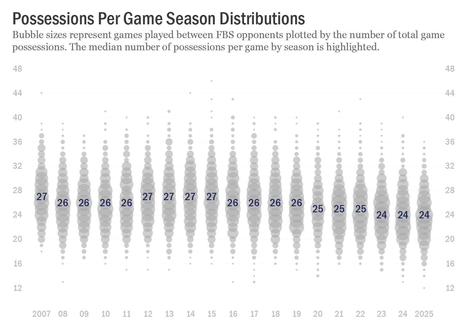
Ward Nash wasn’t the first to develop this style of game possession illustrations, though his 1961 obituary credits him with devising (unspecified) “statistical methods used in collegiate and professional football”. In a brief quest this week to find documentation of the origins of these charts, several kind folks in my social media network shared examples dating back to 1892, a selection of which are provided below.
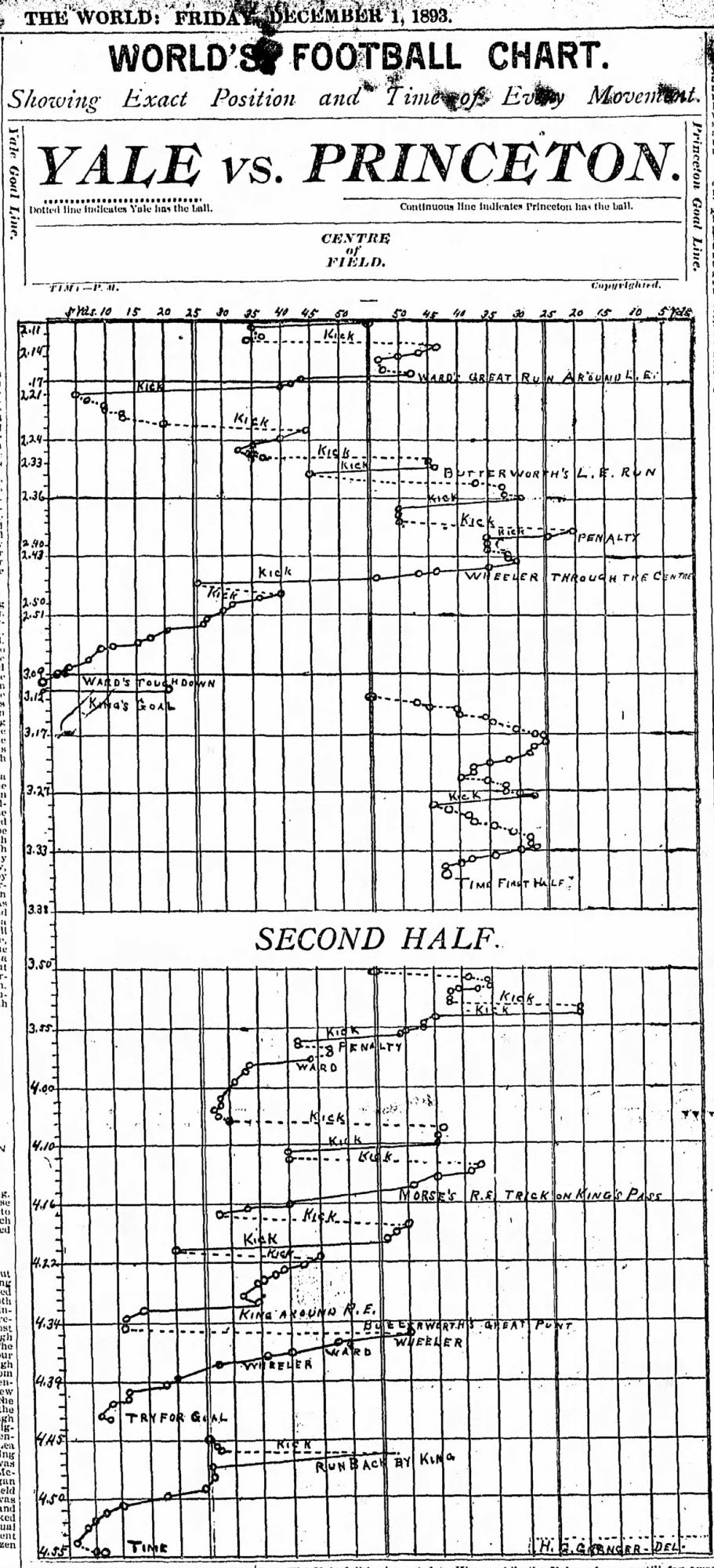
“World’s Football Chart showing exact position and time of every movement” — time of day (not time of possession), that is; Princeton 6, Yale 0 (1893) via @QuirkyResearch
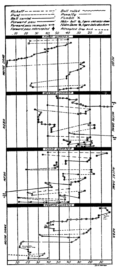
This chart includes details not just of kicks, runs, and passes, but also instances of when the “ball rolled”, indicates the shift in direction of play for each team by quarter, and deviates from a top-to-bottom line progression when necessary to fit possession sequences in boxes for each quarter; Nebraska 14, Notre Dame 6 (1922) via @HuskerMax
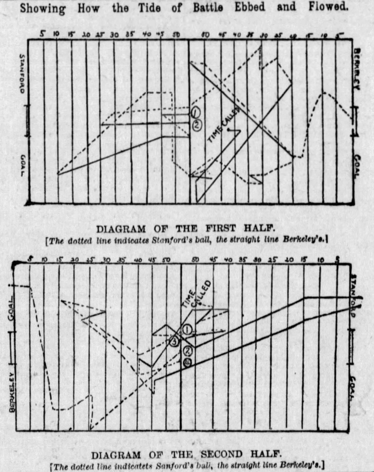
“Showing How the Tide of Battle Ebbed and Flowed” with abstract (?) geometric lines detailing possessions; Stanford 10, California 10 (1892) via @QuirkyResearch
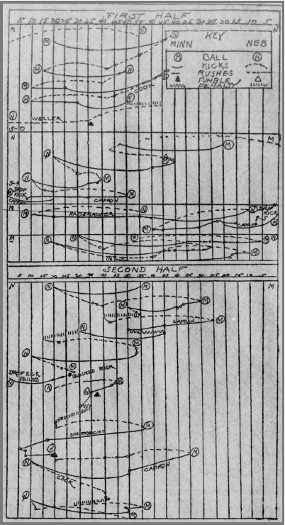
Game illustration detailing only a few basic elements — possession, kicks, rushes, fumbles, and penalties; Minnesota 8, Nebraska 5 (1907) via @HuskerMax
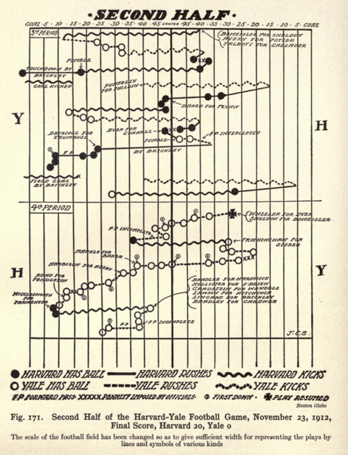
Published in “Graphic Methods for Presenting Facts” by Willard C. Brinton in 1919, a game possession chart details the second half of the Harvard-Yale football game played in 1912.
I’m struck by the design and style variations in each of the examples. It was common for newspapers across the country to publish charts like these throughout the first half of the 20th century, but there apparently wasn’t a rigid style guide adopted by everyone. Even when charts included the same featured statistical elements, they used different methods to encode the information. Kickoffs are squiggly lines. Or dashed lines. Or arched lines. Or hatched lines.
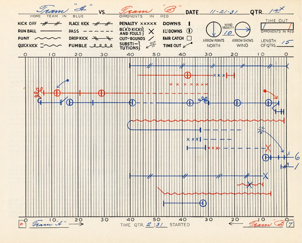
Template with examples of how to chart a football game; “The Official’s Football Chart and Score Book” (1931), via @FootballArcheology