drive plotting

I’ve been working on better ways to visualize college football game data for as long as I’ve been collecting it. This is the start of what I hope/expect will be a series of whiteboard posts about the development and refinement of new game and possession data visualization standards.


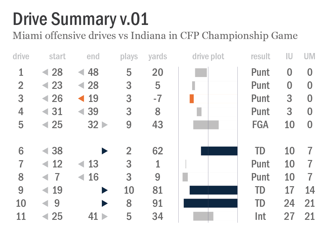
Chart titled “Drive Summary v.01”, an illustrated data table representing Miami’s 11 offensive drives against Indiana in the CFP Championship on January 19, 2026. Each row includes the drive number, starting and ending field position, plays, yards, drive result, and the game score at the conclusion of the drive, plus a graphic representation of the "drive plot".


First, a hat tip to my friend Chris Gallo’s great work over the last few years on new and unique ways to represent drives and possessions here, here, and here. I was also inspired this week by Neil Paine’s drive summary of New England’s offensive possessions in their Super Bowl loss to the Seahawks. I highly recommend subscribing to each of their substack newsletters.

In the Drive Summary v.01 chart above, I’m providing all of the information I collect for every offensive drive in every FBS game. Everything on my site — FEI ratings, strength of schedule and strength of record ratings, points per drive, etc — originates from this basic data set. Where did the possession start and end, how many plays were run, how did it end, and what was the score. That’s it. Rinse and repeat for hundreds of thousands of possessions since 2007.

Data tables are great tools for data analysis, but they’re pretty dry reading. How can I structure a more visually appealing version that invites at-a-glance insight into the the flow of the game? That’s what I’m attempting with this graphic. There are a couple of visual vocabulary elements here in particular that I think are relatively intuitive for casual football fans to easily interpret and understand, and I’m curious if they’re really working the way I think they should.

Where Miami started each of its offensive drives is listed in a column under the ‘start’ header — it’s own 28-yard line, own 23-yard line, own 26-yard line, etc. Just the yard line number itself is provided, accompanied by a small triangle symbol pointing to the left. That little triangle is my solution to avoid using “own” or “opp” (opponent) syntax with every entry, which I think would unnecessarily clutter things. The ‘end’ column uses the same triangle symbol flipped to point to the right for drives that ended in opponent territory.

I also included a ‘drive plot’ with a set of bars that represent the starting and ending field position for each drive. I’ve tried a few variations on this that include more gridlines and annotations, but I think that simplicity here might be best. I also chose to color code touchdowns distinctly (dark blue bars) as well as drives that lost yardage (orange bars). And to reinforce and highlight these drives from the others, I color matched the little triangles in the ‘start’ and ‘end’ columns.

My next step is to work on pairing this with opponent drive data from the same game. I’m genuinely open to questions and suggestions! Is the visual vocabulary clear and easily understood? If not, what might you change or recommend? What other data do you want to see as this develops? Leave a comment or hit me up in another way. We’re just getting started.